

Game On
Brand Creation
During the fall semester of 2018 at Champlain College I attended their capstone class. The point of this class was to use everything I had learned from college over the years in order to create an entire hypothetical brand from the ground up, and hang the final outcomes up at the gallery. We each had to create our own brand based around convincing an audience of our choosing whatever we wanted to convince them.
My project titled “Game On” was based around convincing a 30 to 60 year old audience to get interested in playing video games. It was my goal to highlight the benefits of gaming, and inform my audience of what those benefits are in a way that gets their attention, and resonates with them. My research was split into three different lenses in order to keep the project focused. These lens categories were health benefits, social benefits, and entertainment benefits.
It was recommended to me that I should keep the entire project focused on the positives, and keep judgement out, and I believe that worked quite well. I made the logo as bold, legible and interesting as possible while using light, and inviting colors to keep it relaxed, and neutral, but still positive, and friendly. The color scheme, and font choices are very closely based off the logo as well with slightly darker, and slightly lighter tints of both colors used throughout in order to make the project unified. The fonts used in the project are all different styles of Avinir, again in order to further unify the project. The class helped me decide that the best deliverables given my audience’s age would be four Facebook ads, one general pamphlet, and one event poster.
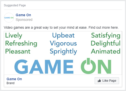
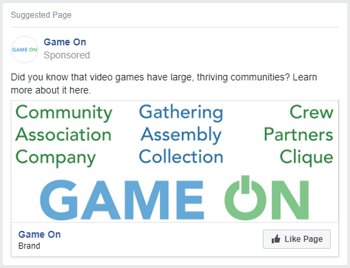
The first Facebook ad was based around the entire project, while the rest were based around the health, social, and entertainment lenses. The design for the picture is meant to represent words that could be used to describe each specific aspect of video gaming, as they are words that I want the viewer to think of when they think of video games.
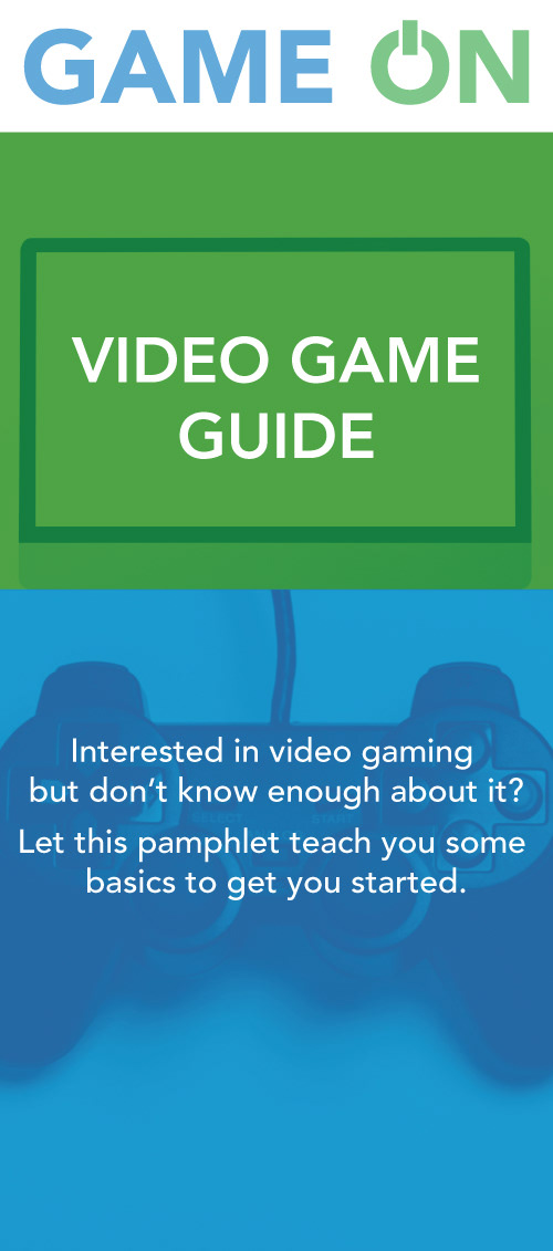
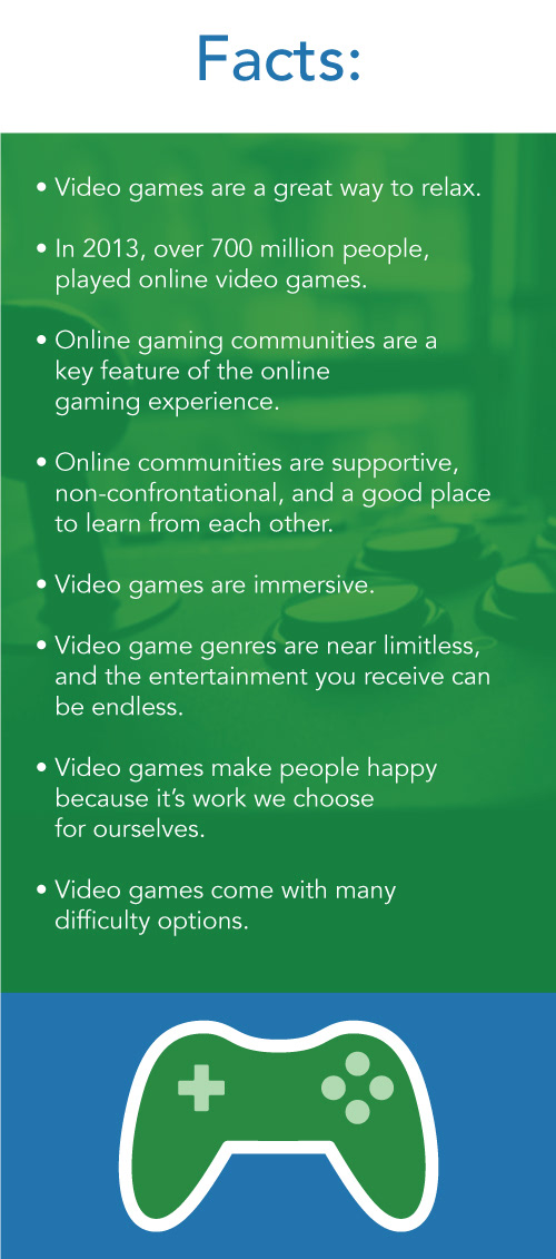
The general flyer I later called the “Video Game Guide” was designed to be a flyer with quick tips that anyone could read at any time that could be supplied at any location. I took a few facts from my research, and represented each lens equally in order to present things that my audience may not know.
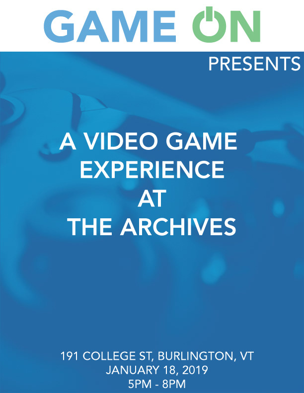
The last aspect of this project was the event poster. This event is what the other two parts of the ad campaign would be leading up to. The goal of this event would be to attract adults to a local Burlington barcade where arcade machines could be used by some, while TVs would be hooked up to consoles for others. I made the poster pretty neutral, but still eye catching, and modern in order to get the attention of any onlookers.
The first process book was made to show both the teachers, and the students how progress has been going, and allow them to give some extra feedback. The final process book marks all important progress, and was printed for the gallery.